|
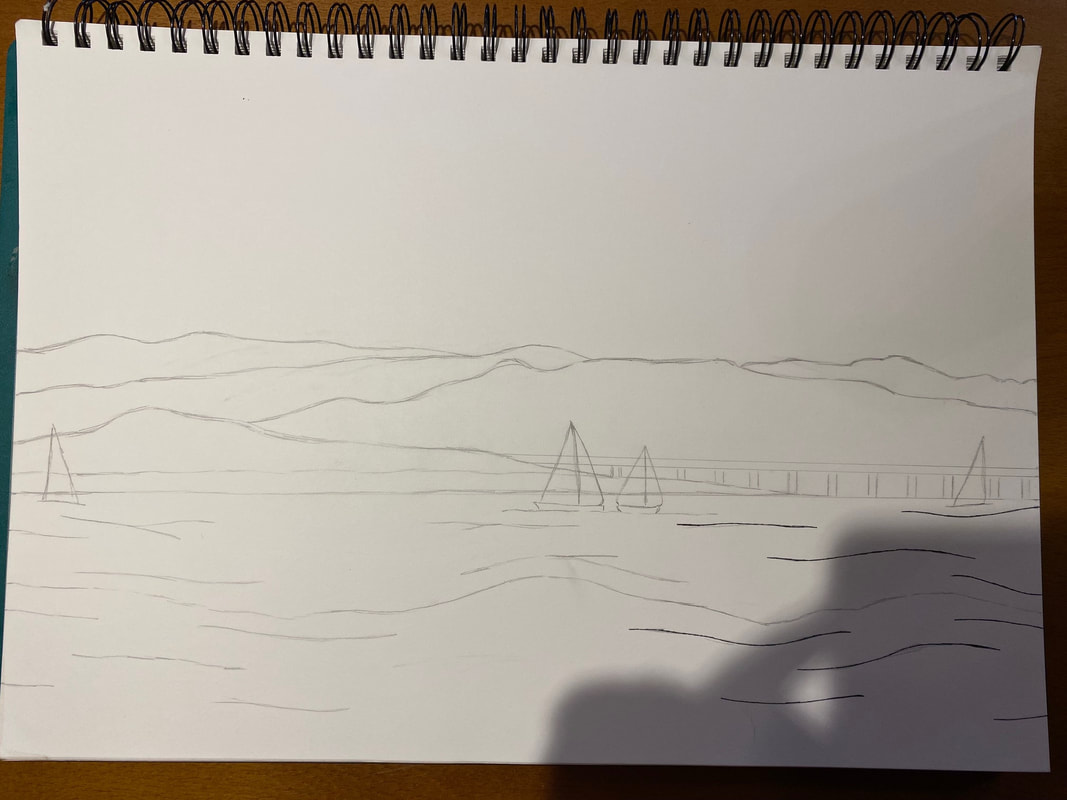
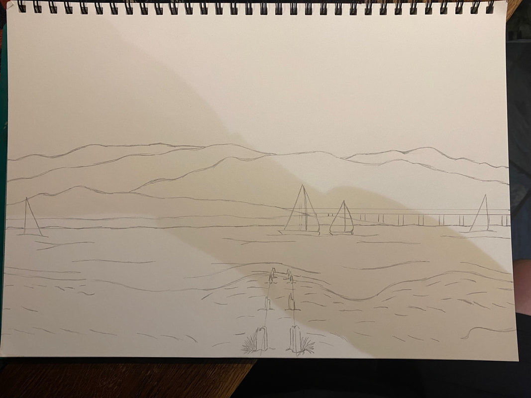
The other week, I was asked by my parents to help and improve the logo of Crossfield's a small cafe and bar in Arnside bay. Me and my family along with any customer who comes the bar has been looking though the window of the bay everyday and my father (Matt Jackson) has been wanting something like to go with the business card set. The Original logo set of JJ Crossfield's:  When I was finally from any other drawing, I got to work on the design. With every spare time I had from home and work I went to JJ Crossfield's or any other pub in the village to get a good view of the bay and using the same composition/set of the original set (the shore, water, sail-boats and birds) to go along with idea. Photos of progress in the first attempt: 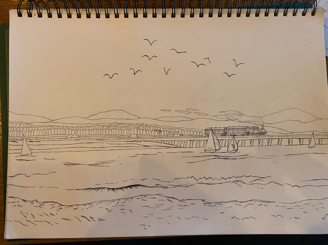 In my first attempt my dad says that it is lovely, but there is too detail because it's going to be in card and it'll be difficult for anyone to see what it is in a small size, and the steam train was not needed (though, I thought this was a good idea, because everyone living in Arnside sees the trains coming and going everyday). I wasn't expecting for him to yes to that (that would been a miracle), but I wanted to sure on what I need to do for next attempt. Photos of progress in the second attempt: 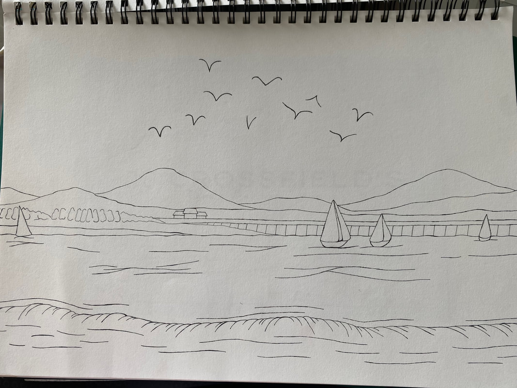 In this attempt, I made less detail on the hills/mountains, the trees and the shore when I showed my dad on what I've done in this attempt we both agreed that I got the hills/mountain wrong, because it's not like they were in the last drawing, and the trees and buildings from a distance are definitely not needed and the tiny curved lines in the shoreline have to go. Some things were starting to get bit clear of what I have to next. Photos of progress in the third attempt: 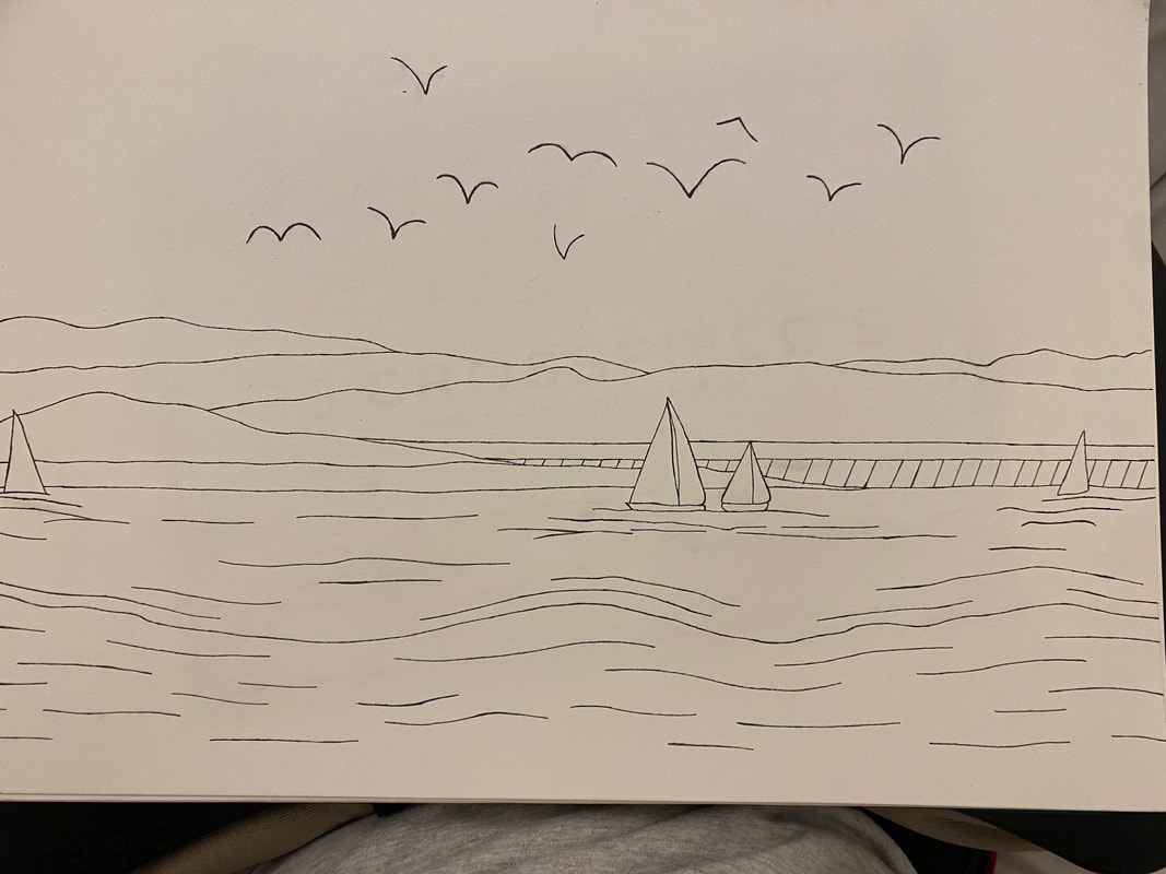 In this attempt, I went to a different pub to try and a the view of the bay at a different angle. This drawing was getting better but me and my dad agree that I put in less bird that are flying in the sky and the lines around the shore should a bit shorter (like I did in the first attempt) and not look like waves on the water. Photos of progress in the fourth attempt: 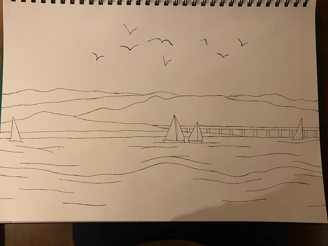 With this drawing, my dad and I are happy to see that I'm getting very close in finishing the project what I needed to do for the fifth and final attempt is get most the in lines thickened similar to the original set and try draw in some tiny stumps what use to be an old pier between the shore and the water. Photos of progress in the fifth and final attempt: This last attempt took a little bit longer than the others but it was worth the effort. The stumps of the old pier, I sketched them more on the middle-right on the picture, before I got to finish the work I showed my dad to be sure of what he thinks, and he says they're more on the left at the edge from the picture he took and it'll be at the very end of the of the drawing, the idea for those ones was something I found on the images in google. So to make sure that I got it right I quickly rubbed out the ones I sketched and put them where should be, and draw where the stumps should be and made them a lot smaller than before. But at the end, I got the work done. The Final drawing set of Arnside Bay for JJ Crossfield's: 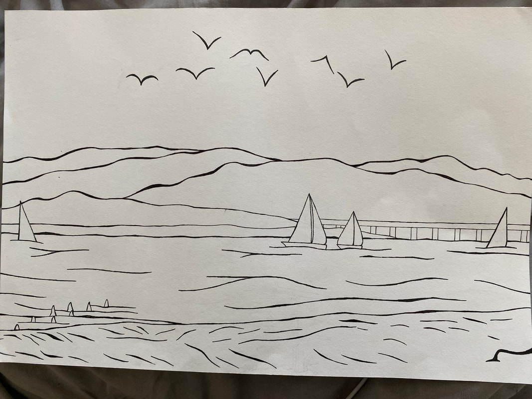 Before I had to go to work, I made sure that my dad has got the drawing in his office, and I hope to see the on the cards and other sets very soon.
0 Comments
|