|
In this finally project before the end of my first year, I’ll be looking through all the work I did, making some notes of what I made, what could I do to improve in the future, then create some sort of art book to get it all together in the book. The book I've called is "Special Memories", and using a sketchbook. I used each page to create a chapter with writing and showing evidence of my artwork.
These are the titles I’ve written from the all the projects I did this year. Next I write down notes before writing it down in full sentences of what I made in these projects mixed with my own artwork. Contents
Introduction My name is William Jackson, this is my first year at University. I was born in Blackpool, and raised by a good mother, father and brother. Growing up and living in pubs and hotels my father has owned since I was a child. Before going to university I spent 3 years of college studying art and design, learning lots of new things in the course, drawing, printing, photoshop and ceramics. Now I am now at university, I’ve be learning a few new art techniques and skills to become a better artist in the future. Digital Magazine DesignsIn the start of my first year at university, I made a couple of digital magazine designs in one or two projects. One magazine was about my trip to Keswick with all of the classmates that are in the same course as I am. The other magazine was about how the pyramids of Egypt were built in ancient Egypt. I did the magazine designs by creating some drawings of my own (comic characters and artefacts), some images I’ve taking from the internet, taking photos from places I’ve been or seen to. I made these magazines in that kind of mixture, because I enjoy reading books since I was a little boy and I have been into comics since I was 10 or 12 years old. What I hope to do this next year to make some more magazine/comic designs and make better written work in them. 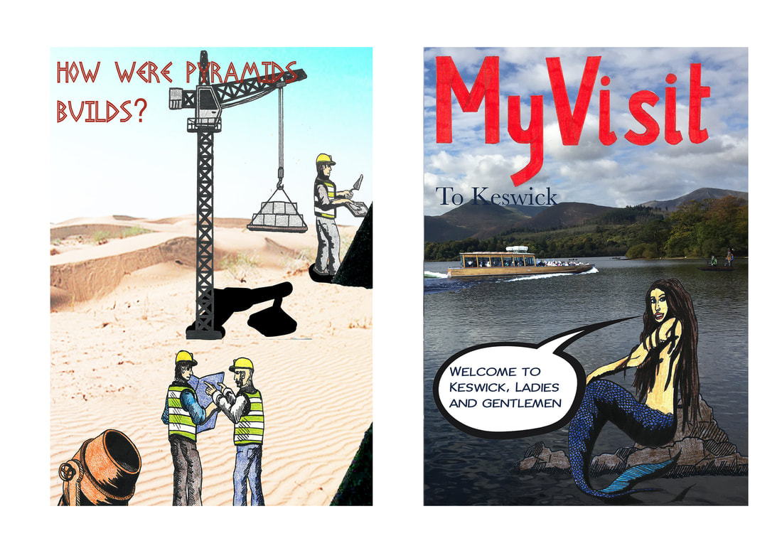 My Own Comic DesignsIn my spare time at college and at university, I have been working on my own comic designs. The other year at college, I did a small comic strip based on the classic novel “Moby Dick”. How I did the work, was in a mixed media set of pen, pencil, dry-point printing (etching) and photoshop (on the computer) each art material I did them in order with one picture after the other with another a mixture of cartridge paper, parcel paper and sugar paper to get a little historic effect in the artwork, they worked really well. The first comic design I’ve made of my own is based on the game trailer Assassin’s Creed Rogue, and the Second comic is based from the movie Armageddon. The name of the comics are called “the hunter” it is short story about man walking through a dark background killing his fellow knights and friends in his path, the second comic is called “Armageddon” a story about how an asteroid had crashed into the earth during the time of the dinosaurs. I did the comic designs in drawing, photoshop and indesign, to make it into a successful comic design. I’m already working in third comic design and more after that. That is something I’m wanting to do in the future, to be a comic artist.  Art RequestsBefore I started going to university, some people have been asking for some of my drawings, from friends of mine and local people from places I use to work. Six people from The Strictland Arms, have asked me for my artwork (a local restaurant and bar) during my time in college.
A couple of tutors from Kendal College, I gave some of my artwork as a thank you for teaching me.
At university I did some birthday drawings of my friends who share the same flat with me in the halls residence. Each of them in comic poster designs.
Project Old SchoolIn the first term at university, I was in my second project after the first project (the digital magazine designs). The project was about creating eighteen to twenty-one task from a set of instructions on paper: OLD SCHOOL Two weeks of exciting and challenging manual tasks where only perfection is good enough! Tasks 18-21 should be started immediately and progressed while you are working on the shorter exercises. As time management and organization are just as important as creativity it is crucial you complete all the tasks within the allocated two-week period. BOOKS TASK ONE (30 minutes): Create an A5, portrait format, saddle-stitched book. It should contain 20 pages of white paper. The cover should be made of a thin, coloured card. The front should feature a decorative motif of four, 5mm diameter holes cut through to reveal the white page below. The holes should run vertically along the right-hand edge: inset by 12-14mm (hole centres) with a spacing between each hole of 40.5mm (centre to centre). Any page creep should be carefully trimmed. TASK TWO (60 minutes): Create an A5, landscape format, stab-stitched book. It should contain 12 sheets of A5 paper and 2 sheets of thin, A5 card to act as a cover. The holes for stitching should be placed at 15mm and 10mm from the left-hand edge. The interior sheets should have a cut, decorative motif achieved as follows: Sheet one contains a 50mm square hole (centered at 95mm from the right-hand edge and 74 mm from the top edge). All subsequent sheets (apart from the last) should also feature a square hole that uses the same centre as above but diminishes in increments of 4mm per sheet (i.e. 46mm sheet two, 42mm sheet three Any page creep should be carefully trimmed. TASK THREE (45 Minutes): Create an A5, landscape format, perfect bound book. The cover should be made from a thin card. The spine should be at least 5mm wide. The first 20 pages should be vertically perforated 50mm from the right- hand edge. The final two pages should fold out (by an additional 40mm). Any page creep should be carefully trimmed. Presentation TASK FOUR (10 minutes): Window mount a postcard behind an A4 sheet of mounting card. The mount should be hinged to a backboard. The hole should be cut with a 45-degree bevel. TASK FIVE (10 minutes): Surface mount six postcards (all in the same orientation) on a mid-grey sheet of thin card TASK SIX (10 minutes): Using a pen draw the outline of a perfect, 47 mm square in the middle of a sheet of A4 layout paper. This should be presented in pristine condition, the only marks on the paper being the ink outline of the square. TASK SEVEN (10 minutes): Take an A4 piece of thin card. Using a compass draw a circle with a 50 mm radius, centered on the sheet. Using a scalpel or craft knife cut out a perfect circle. Both pieces should be retained and presented. The curve should be continuous and smooth (no corners)! TASK EIGHT (20 minutes): Emboss a circle, square and equilateral triangle onto a sheet of white, A4 cartridge paper. The shapes should be 45mm high, share a baseline and be centered (landscape) on the sheet. TASK NINE (30 minutes): Cut the word SHOP out of black paper and mount it on an A3 sheet of white cartridge paper. The word should be set in uppercase letters 90mm high, be carefully spaced (kerned) and sit on a common baseline. You should use the font Rockwell Extra Bold. As with all the tasks, no glue or construction marks should be visible. The Third DimensionTASK TEN (30 minutes): Using thick paper/thin card, create a perfect, white cube. Each side of the cube should be 90mm long. TASK ELEVEN (60 minutes): Using black, thick paper/thin card create a three-dimensional capital letter ‘R’. You should use Rockwell Extra Bold and the letter should be 150mm high and 40mm deep. It should appear solid when viewed from any direction like this… TASK TWELVE (10 minutes): Create a full-size; first angle orthographic projection of your 3D letter R. All construction lines should be in pencil with the actual projection rendered in black ink. TASK THIRTEEN (10 minutes): Create a full-size oblique projection of your 3D letter R. All construction lines should be in pencil with the actual projection rendered in black ink. TASK FOURTEEN (10 minutes): Create a full-size isometric projection of your 3D letter R. All construction lines should be in pencil with the actual projection rendered in black ink. Colour and ToneTASK FIFTEEN (90 minutes): On a stretched sheet of A3 cartridge paper, using red, blue and yellow paint create a colour wheel that looks like the one to the right (omit the text). The diameter of the wheel should be 200mm. TASK SIXTEEN (30 minutes): On the same sheet of stretched cartridge paper and using black and white paint, create a sixteen step Grey Scale that looks like this >>> Dimensions: 240mm high X 50mm wide TASK SEVENTEEN (30 minutes): Using the same format as above, select one of the secondary colours you mixed earlier and position it in its correct position on the Grey Scale. Now create a tone scale for the colour by adding black to darken it and white to lighten. The scale should be positioned 15mm to the right of the Grey Scale. When complete, each step should be tonally identical to each of theGrey Scale steps that lay along side. Squint your eyes to accurately judge tone! A Parting of the Ways… Tasks for Graphic Design StudentsTASK EIGHTEEN (60 minutes): Print out the above document – Type Rendering.pdf. On good quality tracing paper and using a sharp 2H pencil, carefully render all the copy at actual size. No construction marks should be visible on the tracing paper. TASK NINETEEN (90 minutes): Following the instructions (Constructed R Instructions) draw this letter to fill an A2 sheet (landscape format). All construction lines should be included (either pencil or fine line pen). The finished R should be solidly inked in with… … ink! TASK TWENTY (3 hours): This is a poster designed by a German poster artist Erich Gruner. The original is painted in gouache (poster paint). Using paint, create a perfect copy on a sheet of A3 paper. All colours and textures should be identical to the original. We will be looking for accuracy of colour, tone and edge quality. TASK TWENTYONE (4 hours): A series of exercises to develop a feeling for curves… Print out these three sheets (Exercise 1-3) at actual size (A4) and complete each design. You should use a pen for 1 & 2 and a brush for number 3. Most of the designs are symmetrical but please note; a few are asymmetrical. They come from a Victorian book of instruction for school children. Print out these two sheets (Exercise 4-5) at actual size (A4). Using brushes and black ink copy them at approximately the same size on an A3 sheet of cartridge paper. This is the only exercise where no preliminary drawing or tracing is allowed – all drawing should be done with the brush. Tasks for Illustration StudentsTASK EIGHTEEN (60 minutes): This portrait of a Breton boy by Henry Lamb is a pencil drawing on cartridge paper. You are asked to make an accurate copy of it using the appropriate grades of pencil – as with all these tasks you can base it on a tracing. The drawing should be approximately 150mm mm high. TASK NINETEEN A (2 hours): This is a dip pen and ink illustration by Mervyn Peake. Make an accurate copy of it using the original media and techniques The image size should be approximately 140 mm high. TASK NINETEEN B (3 hours): TASK TWENTY (3 hours): This is a wood engraving by Clare Leighton Produce an accurate copy of it using scraperboard. The image should be approximately 180 mm tall. This is a watercolour by Arthur Melville. Reproduce it at the size of 300mm high on stretched watercolour paper. TASK TWENTYONE (2 hours): This illustration by Brad Holland is painted in Acrylics on canvas. Paint an accurate copy of it 250mm high. When I started these tasks, they all seemed simple enough to do, making small (A5) sketchbooks, creating 3D paper models and making some drawings in the artists’ style. I didn’t finish all the task, but when I presented my work, along with everyone else's artwork with the same tasks I had in this project to the tutors. They told me I had almost succeed everything, there were some I didn’t go the way they should, either I didn’t follow the instructions properly or I didn’t read the brief more. What I needed to do in the future, is read the briefs of the project a bit more carefully and if I need to ask for help on what I need to do, I’ll go to the them. Learning on How to make a VideoDuring my first year, there were a couple projects that are video designs. Planning the video is one thing, making the video is another. One video project was a stop-animation of a pack of Haribos curling into a ball, then a phoenix emerges in the centre and flies away. The other was working with one of classmates Lily of a short thriller film of ourselves in old book shop, where Lily walking around the library shelves for a book, till I attack and kill her with another book in my hand, then later on a friend of mine is walking around town till he finds Lily’s body by the water fountain. That's the idea creating a video. The videos didn’t go exactly the way I wanted them to be, but I did my best I can with them. The problem was, I had use computer apps Premiere Pro and After Effects and learning how to use them was really difficult to do. Because I haven't used them before. What I’m planning to do in the future is learn more how to use these apps to make some more video designs of my own, to get some sound effects in them, and for some of my own artwork, because I think it might come in handy and I have a friend who could teach me some things in creating videos. When it comes to computers, create art in them is more difficult than drawing them in paper. Workshop SessionsIn the first term I've been going to some workshops, to learn new things for illustration and graphic design like, text-style, print-making, wood-making, photography and metal-making. I enjoyed going to them. The workshop were in six sets…
1. Metal- Going to the metal workshop was the first time I’ve ever been to in any art course, what I made in there was a metal sculpture of a dragon and took it home with me as a Christmas present for my brother, he loved what I made for him. I haven’t done any sculpting since I was thirteen, I use to do small paper sculptures dinosaurs and thunderbirds in my spare time when I was in secondary school. 2. Photography- Going to photography was the first workshop session I went to, so using a camera and (if we wanted to) using Lightroom for adjustments was another thing I was familiar with and of course there is the darkroom I’m familiar with, I did some of these in a few projects when I was in college. The darkroom photos I enjoyed the most, because there is some mystery in the objects without any details or colour. I also learned how to use ultraviolet photography which was fun do to and interesting, I wouldn't mind doing that again. 3. Print- Doing print-making is another thing I'm very familiar with, when I was in college I did lots of printing (lino-printing and Dry-point etching). Now at university I did some more of that and learnt how to do etching using metal plates for the first time, because I used other materials to get some shading or tonal effect. When I used the plate to the prints and made some good texture and composition. Next year I’m planning to use more of these prints for one or two of my own artwork. 4. Wood- I've made wood before, when I was in secondary school, so wood-making is a little familiar to me, the fun bit was making a couple of business card-holders for my brother and my dad for Christmas. And then doing some small drawings on them. They're both happy for what I made. 5. Silkscreen- Learning how to use silk-screen printing is different then from learning how to use lino-printing or dry-pointing printing, but it was very good to try, because I did a couple of colours in one print but I think I can put in some more colours in other prints with more practise. 6. Embroidery- Using the sowing machine in textile was a tricky task, because I'm not that very good in textile but with practise and patience I might get by one day. From the digital magazine of the pyramids I did a bit of artwork of the pyramids, the equipment and materials of how they were built. I might get better at other things in text-style. Christmas Drawings for Friends and FamilyNear the end of the first term, before the Christmas holidays, I did some drawings for my friends and family as Christmas presents. I did loads of poster-like-comic designs for nearly everyone during the holidays, there were two or three people I didn’t get any drawing for them because they've just been invited into the family or I didn’t know what to draw for them.
I am very proud of doing these drawings, next Christmas I'll be planning to do some new drawings. Art AssessmentFrom the other projects me and everyone else's in this course, in the first term we've been doing some art assessments from one of the tutors. The assessment is about working in a small group in four or five, designing our own characters in any decade and country we’ve been given and then creating a video game together. The decade and country we got is the 1960s Britain. What I enjoyed doing the most was creating my own character design. The did a character was based upon my brother David. At Secondary school I was making comic drawings based on the classic novel “The lost World” where there is a secret land full of Dinosaurs, my brother asked me to add him in the story, so did a few others who asked if they can be part of the comic story. The funniest bit is when he asked me was “Do not kill me in the story” and I said “Maybe”, so from looking at all the other character designs I’d drawn, I thought for this assessment would be cool to create the character of my brother again. I did another character of a lizard man, but everyone in the group liked my brother better. For something like that, I hope to do some more character designs. It's fun. Bottle-Top DesignsSometime around February, I made spare-time making some new designs of my own. Back at home me, my brother and my parents have been collecting bottle-capes, placing them in a large glass jar. And since my Father owns the Brewery in Lancaster I thought I could create some designs for him. When I start my first year at university and later on my job at the bar and hotel (Gosling Bridge) in Carlisle I've been do my own bottle-cape collection. So around February I use the bottle-capes to create new designs for my Dad and the brewery. At secondary school I did a drawing of the brewery when it was built in out of Lancaster for my Father and other staff members, they used the work for display on the pump-clips, posters, on bottles and on the brewery vans… this is something that has made me really happy to see. What I did for the bottle-capes is stuck them in a large planks of wood and then paint over what I want to paint. So far I have made three bottle-cape designs of the Lancaster rose, the title of “Lancaster the Brewery”, and third design is about putting quotes from the back of the bottle-capes I collected from the brewery, so far only my parents and my brother and my friends know I have made these designs, and soon the staff members of the brewery will be surprised for what I made. Perspective DrawingsAround October (Halloween), I did a project of perspective drawing there are other kinds of perspectives from whatever the eye is seeing.
The first thing I did was doing some practise in the drawings of perspective set on cubes or cuboids, one or two chessboards, and one or two objects, next I did some more with some background. A chess set in a human/worm’s eye view at once, a steam train of the famous Flying Scotsman, then the last perspective drawing, I did was of a deer park with sheep at a distance with my family dog in close-up and a tunnel with one of my flatmates Freddie at the other side of the tunnel entrance. When I presented my work to my tutors, they were impressed that I understood the meaning of perspective, but the drawings weren’t exactly what they asked for. the drawings they asked were of a dark alley street with a cat in the centre. This is why I need to read the brief of the projects a bit more. Look on the bright side, at least I tried. Creating My Own Book CoverBefore I went home for the Christmas holidays, I was given a project about creating a book cover an artist’s style. But First I need to do some research on the artist I was given in the project. The artist I researched was Rockwell Kent, an illustrator who has done his artwork in a mixture of drawing pen, painting and printing. Seeing some of his artwork is a little like going back in time, due to some of the book covers and pictures he has made. In that I picked which book I'd like to create for a book cover like:
These were the chooses I needed to make, to create my own book cover. At first I wanted to do a book cover of Moby Dick, but since I’ve designed a comic strip of it at college I needed to try something else. The cover I chose is Murder on the Orient Express. I chose this because I’m trying to do something different, plus my grandfather and I enjoy trains. I've made lots of drawings and prints of trains, the weapons from the murder (knife and gun). They were okay but weren’t exactly the style from the artist I was given in the project, eventually I did the artist’s style, made a couple of more drawing and decided which is the best one. What I think could improve the work is if I were to add a touch of red (blood) to make it a bit more like a murder.  Creating My Own Record CoverAfter the Christmas holidays I started on the next project straight away at university. I was asked to create a CD/record cover based on the bands and the songs we were given from our tutors. The bands and songs I was got were…
Doing some research and listening/watching the songs, I chose to do the Formidable Joy- This Ladder is ours! Looking at the video and reading the lyrics from the song, I then think of something I did when I was in college last year. I was working on one or two songs I like and (Take That- Rule the World or Tinie Tempah- Wirtten in the stars), using a couple of lines from the lyrics and designing a portrait of the song. This was something I did for a record cover on the Formidable Joy, doing some drawings, lino-prints and Photoshop designs I have printed from the computer and carefully cut and stick the design together, to the size and shape the record cover should be in. Presenting the design to my tutors, they tell me they record captures the imagination, energy from the pictures and quotes from the song. If I was asked to create another record, for another song, I would chose the song I like to do. Live- Drawing SessionsDuring the second term, I was joined with my classmates to go to live-drawing sessions. When I was in college there were some live-drawing sessions going on a few times, but I was never evolved any of them, it was for the older students, this year is the first time I went to any of them. Every week we were given a spot with a stand, board and A1 paper and the models we use for our artwork take turns every week and every week we use different art materials to try out new things (trying to get us out of our comfort zone). The models were a man named Nick and a woman named Helen. The materials we used for the drawing/painting every week were…
Most of the drawings I did of the models I’m quite proud of, there are some drawings I think I could do a lot better with then on, what I needed to do to make the live-drawings better in the future is practise by looking at the drawing with one eye and looking at the subject/object with the other eye. Typography ProjectsWhat was a little more challenging and a little frustrating was the typography projects. One project was about creating an article I was given and write in a few sets which are:
The article I was given was… The Sun: Living with Our Star Discover the story of humanity’s ever-changing relationship with our nearest star - the Sun - through hands-on expe- riences, unique objects, and stunning imagery in our latest exhibition. Set at the centre of our solar system, the Sun’s brilliant light shapes our sense of time, our health and our environment. People have tried to harness its power and uncover its secrets since the dawn of civilisation. From 3,000-year-old artefacts to upcoming space missions and even a nuclear fusion reactor, our new exhibition takes you on a visual, action-packed journey that brings the science of the Sun to life. Bask in sunlight on an indoor beach, try on historic sunglasses in a digital mirror, and watch the Sun rise around the world on a huge illuminated display as you explore the fascinating story of humankind’s relationship with our closest star. During the exhibition there will also be a screening of the absorbing documentary ‘Let There Be Light’. The screening is followed by a discussion—and most likely no shortage of lively debate—about the viability of nuclear fusion and solar energy as the answers to reducing our reliance on fossil fuels. 6 October 2018 – 8 May 2019 Tickets £16, under 16s free, other concessions available Special Exhibition Gallery, Level 1, Science Museum, Exhibition Road, South Kensington, London, SW7 2DD www.sciencemuseum.org.uk Doing this was a little frustrating because I needed to get them…
And get the titles and sentences in a good composition was difficult to do, because from all of that this was the first time I created a type of article. But when I got it all printed out and set in A1 grey card paper, the tutors have told me I made some good and strong composition in them and getting all the words in the same size as I’ve made them to. In the other typography project, was about creating a poster for a on-coming festival about creative typography, so I needed to create my own poster design and the tutors can decide which is the best to have mine or someone else's. I'd wish they took my design despite it as a strong composition and good information about the festival, but somehow I got the information a bit big than the last typography project which is a bit disappointing, but the bright side is I enjoyed doing some artwork experiments on drawing, colouring, painting and cutting typography fonts A to Z. If I were to do it again was, only get the information a bit smaller, but create some more colourful and creative fonts.   Logo/Packaging DesignsWhat was a little more challenging and a little frustrating was the typography projects. One project was about creating an article I was given and write in a few sets which are:
The article I was given was… The Sun: Living with Our Star Discover the story of humanity’s ever-changing relationship with our nearest star - the Sun - through hands-on expe- riences, unique objects, and stunning imagery in our latest exhibition. Set at the centre of our solar system, the Sun’s brilliant light shapes our sense of time, our health and our environment. People have tried to harness its power and uncover its secrets since the dawn of civilisation. From 3,000-year-old artefacts to upcoming space missions and even a nuclear fusion reactor, our new exhibition takes you on a visual, action-packed journey that brings the science of the Sun to life. Bask in sunlight on an indoor beach, try on historic sunglasses in a digital mirror, and watch the Sun rise around the world on a huge illuminated display as you explore the fascinating story of humankind’s relationship with our closest star. During the exhibition there will also be a screening of the absorbing documentary ‘Let There Be Light’. The screening is followed by a discussion—and most likely no shortage of lively debate—about the viability of nuclear fusion and solar energy as the answers to reducing our reliance on fossil fuels. 6 October 2018 – 8 May 2019 Tickets £16, under 16s free, other concessions available Special Exhibition Gallery, Level 1, Science Museum, Exhibition Road, South Kensington, London, SW7 2DD www.sciencemuseum.org.uk Doing this was a little frustrating because I needed to get them…
And get the titles and sentences in a good composition was difficult to do, because from all of that this was the first time I created a type of article. But when I got it all printed out and set in A1 grey card paper, the tutors have told me I made some good and strong composition in them and getting all the words in the same size as I’ve made them to. In the other typography project, was about creating a poster for a on-coming festival about creative typography, so I needed to create my own poster design and the tutors can decide which is the best to have mine or someone else's. I'd wish they took my design despite it as a strong composition and good information about the festival, but somehow I got the information a bit big than the last typography project which is a bit disappointing, but the bright side is I enjoyed doing some artwork experiments on drawing, colouring, painting and cutting typography fonts A to Z. If I were to do it again was, only get the information a bit smaller, but create some more colourful and creative fonts. Thank You for Reading...Thank You For Reading…
Being at university has been different and challenging than it was at home and college. I came to university not only to learn more art and design, but to learn how to live with by myself away from my parents and family. This has been a good year. Doing some new artwork and skills has not only been challenging (driving me out of my comfort zone), but has made me learn new things in the course. Maybe then these new skills will let me do them again, to help me become a better artist in the next two years. Who knows?… Maybe you’ll do something like I've done too. This was what written down in one of my sketchbooks that I haven’t used yet along with a lot of my artwork next to the writing to get an idea of what I made and designed at the University of Cumbria. When my tutors saw what I made I was given good feedback for being thorough with my artwork and information, but I need to check for any spelling mistakes and add in some artist research.
0 Comments
|


